NNA
Guided Selling Journey
Summary
Mission
The Guided Selling Journey helps new notaries choose the right package in a space that can be confusing and high-stakes. The original flow felt dated, especially on mobile, and wasn’t performing as well as it could. The mission was to redesign the experience so customers could quickly understand their options, compare packages, and move forward with confidence—while improving click conversion across devices.
My Contributions
I led the redesign of the Guided Selling Journey for both mobile and desktop. I created detailed wireframes and mockups, with a strong focus on modern, card-based layouts for mobile. I presented concepts to the Marketing team and stakeholders, iterated based on feedback, and guided the work through an executive review. I then collaborated with the Test Planning team to design an A/B test comparing card and table layouts, and worked closely with Bridgeline developers to implement the winning designs and refine the UI during development.
Service
-
UX strategy & user flows
-
Mobile-first UI design
-
A/B test design (card vs table layouts)
-
Data-informed iteration
-
Stakeholder alignment & executive review
-
Developer collaboration & handoff
My Role
Product Designer & UX/UI Designer
Impact
The redesigned flow and A/B test significantly improved how customers moved through the journey, with clear wins on both mobile and desktop.
+21.2%
Increase in mobile click conversion from the card layout (62% statistical significance)
Device-optimized experience
Card design implemented on mobile, table design on desktop for best performance on each platform
+4.78%
Increase in desktop click conversion from the table layout (61% statistical significance)
Stronger design–dev collaboration
Detailed handoff and multiple UI reviews ensured the built experience matched the approved designs
Overview
The Guided Selling Journey helps new notaries choose the right package in a complex, high-stakes space. The old flow felt cluttered and dated, and it especially underperformed on mobile. The goal was to redesign the experience so users could quickly compare options, feel confident in their choice, and move more effectively into the purchase path.
.png)
Process
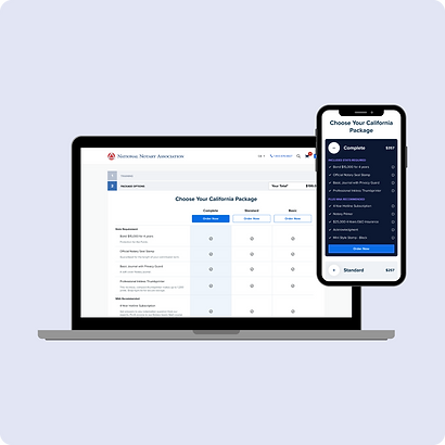
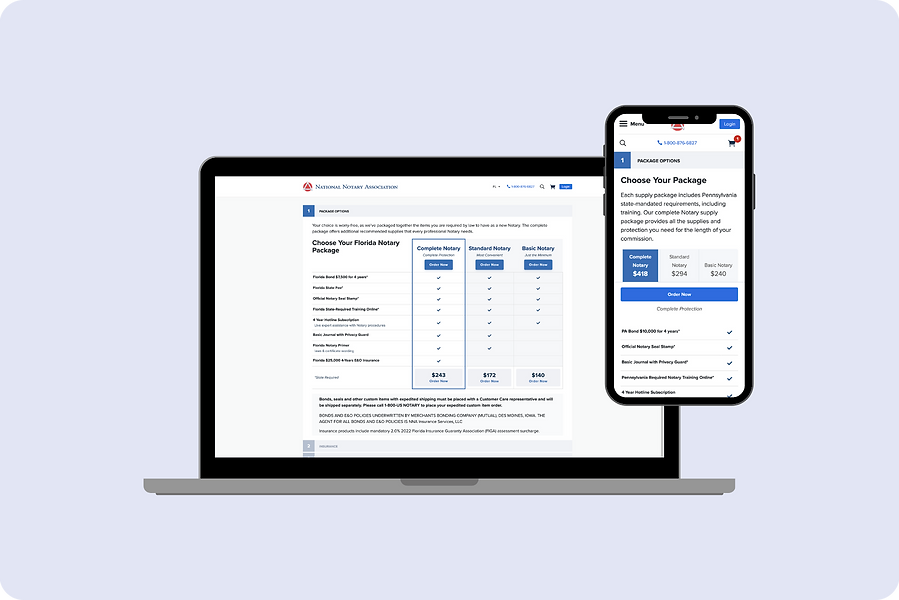
I reviewed existing performance data and walked through the journey on both mobile and desktop to pinpoint where users were getting stuck. I then designed and prototyped two main layout paradigms: a modern, card-based experience and a cleaner, updated table layout. Cards emphasized clarity and scannability on smaller screens, while the table made sense for more detailed, side-by-side comparison on desktop. I collaborated with Marketing and our Test Planning team to turn these into A/B test variants, defined success metrics, and partnered with developers to implement the designs, reviewing builds to ensure visual and interaction details matched the intent.
.png)
Impact
The test showed that the card layout worked best on mobile and the refined table layout performed better on desktop. We adopted a hybrid approach, using the optimal layout per device, which led to improved click conversion and a more intuitive, modern experience overall. The project also strengthened our testing culture by proving the value of validating layout decisions with data rather than relying on preference.
.png)
Next Step
The next step is to roll out the new guided selling design across all 50 state-specific pages and closely track conversion rates as the updated experience goes live in each market. As we gather more data, I’d like to keep refining the flow through additional experiments—adjusting copy, layout, and emphasis where needed to support the unique needs and behaviors of customers in different states.